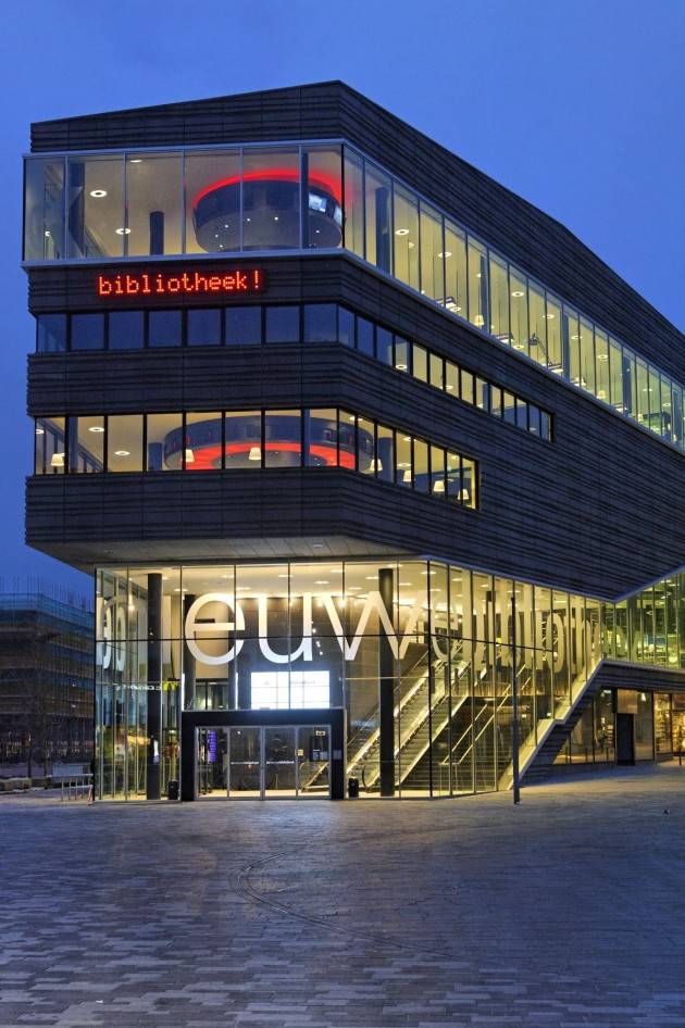
When the city of Almere, The Netherlands commissioned Concrete Architectural Associates to design their new public library, they asked for a library that was less like a library and more like a bookstore.
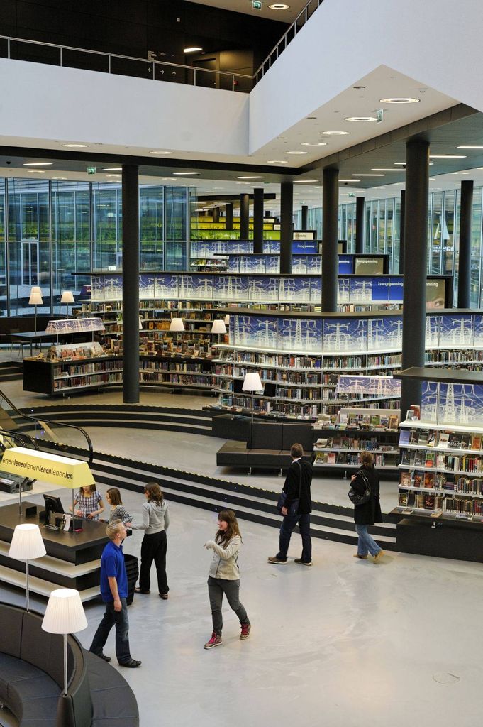
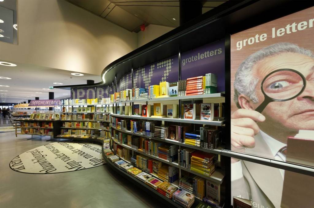
The result was a space that looks and feels like a high-end store but provides all the services of a modern library. The 16,000+ shelf-feet of books are arranged by lifestyle categories that would be at home in a bookstore (travel, health, etc), and all books are displayed cover out. This combination, Concrete says, fosters browsing and discovery, rather than the more conventional library system of finding a particular book’s cataloging number and then searching for it specifically in stack-like shelving.
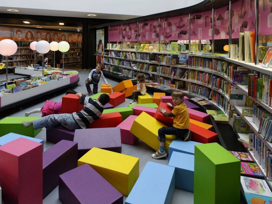
Seating is also built into the shelving areas, much like I remember from my favorite Borders, along with study and work areas. A cafe sits next to the computer workstations, and the children’s area has big, movable foam pieces for seating and play.
Seems pretty great to me? Thoughts from heavy library users or librarians?
Source: bookriot.com


.jpg)


Δεν υπάρχουν σχόλια:
Δημοσίευση σχολίου